Wim Crouwel’s Brochure
This brochure is about Wim Crouwel, a visionary designer whose work reshaped modern graphic design. Known for his grid-based approach, he balanced creativity with precision, creating clean and structured layouts that defined a new design era. His experimental New Alphabet typeface challenged traditional forms and embodied a futuristic spirit that continues to inspire contemporary designers today.

Overview
Project Brief
Key Objectives
Design Recommendation
UI Design and Branding
Reflection
Takeaways
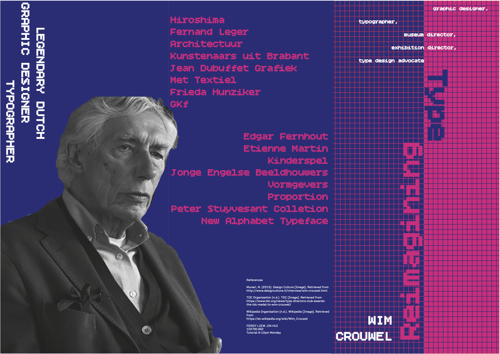
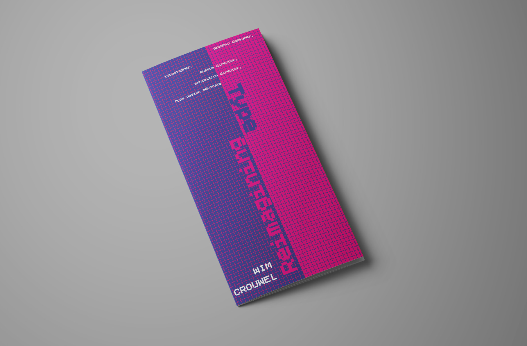
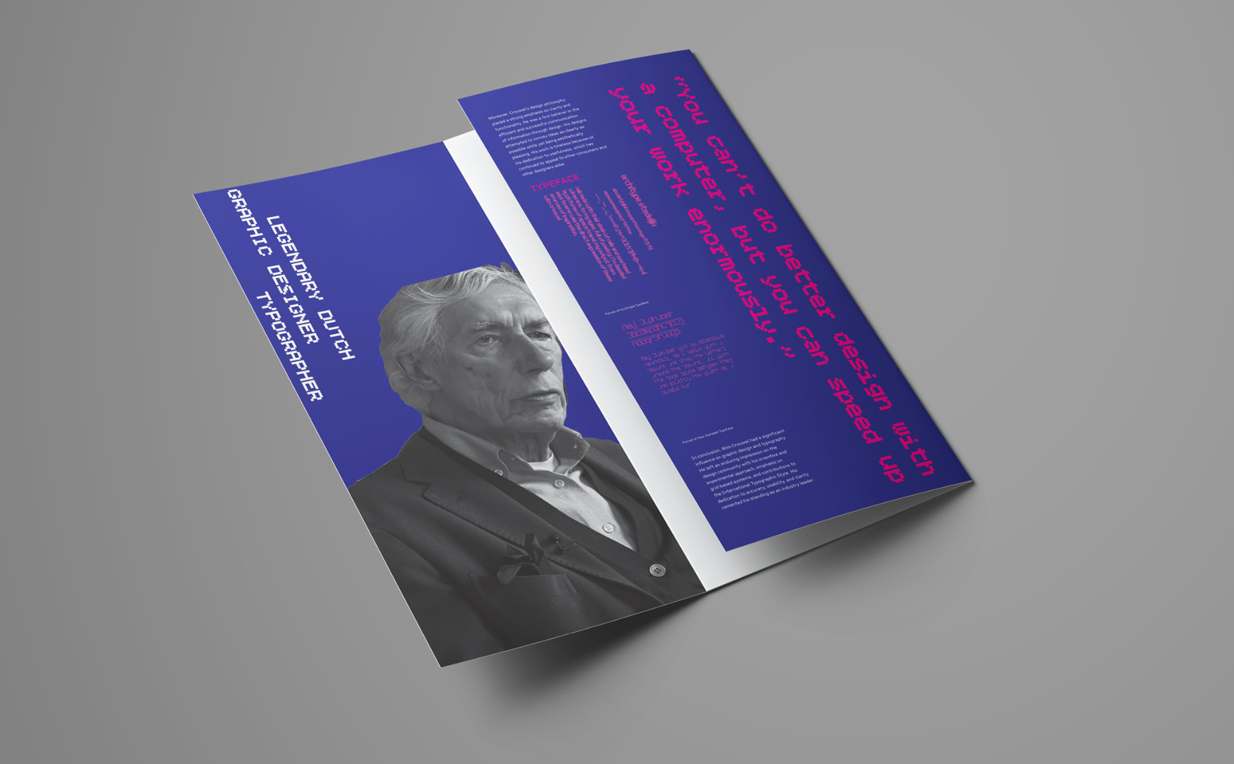
This brochure project explores the legacy of Dutch graphic designer, Wim Crouwel, focusing on his pioneering contributions to modern typography and grid-based design. The work reimagines his design philosophy through a contemporary lens while celebrating his impact on structure, clarity, and typographic experimentation.
The goal of this project was to research, design, and produce a printed brochure that visually and conceptually represents the life and work of a twentieth-century designer. My chosen designer, Wim Crouwel, is renowned for his grid-based systems, minimalistic aesthetics, and experimental typography, particularly his New Alphabet typeface.
To design a brochure that visually communicates Crouwel’s design philosophy.
To apply typographic hierarchy, layout grids, and type pairing in a cohesive, modern design.
To create a clean, structured layout that reflects the precision of Crouwel’s style.
To strengthen my skills in InDesign, typography, and composition.
Problem Statement
Research Goals
Primary Research
Crouwel’s work is deeply rooted in structure and precision, but translating his systematic approach into a brochure that feels contemporary, engaging, and not overly rigid was the main challenge. The design needed to balance order and creativity, staying true to his legacy while remaining approachable and visually dynamic.
1. The historical and cultural significance of Wim Crouwel’s work.
2. How his grid-based and typographic systems influenced modern design.
3. The ways his minimalist Dutch design style could inform a new visual interpretation.
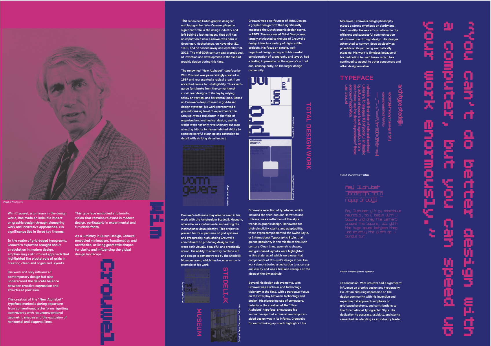
I gathered biographical information, visual references, and type specimens from reliable design archives and museum sources. I studied Crouwel’s work for the Stedelijk Museum and Total Design, identifying recurring design principles such as geometric structure, modular grids, and typographic balance. These findings guided my visual direction and font selection.
Based on research insights, I applied Crouwel’s design principles by:
Using grid-based layouts to maintain order and consistency.
Employing minimal colour palettes (cobalt blue, pink, and white) to echo modernist aesthetics.
Pairing Bitcount Grid Single with Rigid Square typefaces to reflect both structure and readability.
Ensuring a clear visual hierarchy for readability across titles, headings, and captions.
Although a print project, the brochure followed digital design thinking, focusing on user experience through layout clarity and visual flow. The branding for “Reimagining Type” symbolised both homage and reinvention, reflecting how Crouwel’s influence bridges traditional print and digital design principles.
Designing this brochure deepened my understanding of typographic systems, grid design, and the discipline required for modernist composition. The process taught me how structure can enhance creativity rather than restrict it. Using InDesign grids improved my ability to organise complex visual elements with clarity and precision.
Learned the value of structured creativity through grid-based design.
Improved technical skills in InDesign, type pairing, and layout hierarchy.
Gained confidence in combining research with visual storytelling.
Strengthened my appreciation for modernist design and its timeless influence on contemporary visual culture.